Pulse
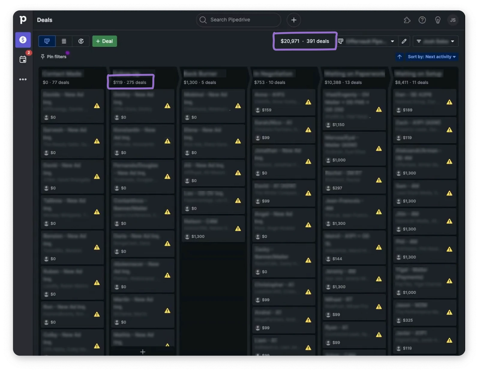
a rep screenshotted his own pipeline so he'd remember where he stopped. that's where pulse started.
the problem
“i start at the bottom of the column and work my way up. when you have 300 deals, you might not hit them all in one day. so i take a screenshot of where i left off.” josh wasn't fighting the software. he'd built a second one on top of it out of screenshots and notes-to-self, and he maintained it for free. 63% of pipedrive users carry more than 100 deals. those users win under 30% of them. volume up, conversion down — backwards from how a sales tool should work. reps weren't missing a feature. they were managing their time, attention and momentum by hand.
the setup
pipedrive is a deal-based crm for 110k+ businesses. pulse grew from one experiment into four workstreams across three r&d teams, each with its own pm, designer and engineers. i was design lead for the toolkit and the hands-on designer on two of the four. so i spent as much time holding the whole thing together — rituals, prioritisation, the patterns we shared between features — as i did in figma.
what we built
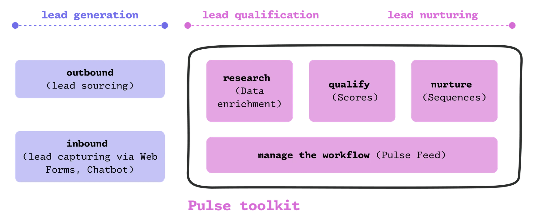
a lead arrives. a rep researches it, qualifies it, nurtures it. and underneath all three, constantly, they manage the work itself. pulse put one tool against each: data enrichment, scores, sequences — and the feed, where you decide which lead to touch at all. ga'd july 2025.
the feed
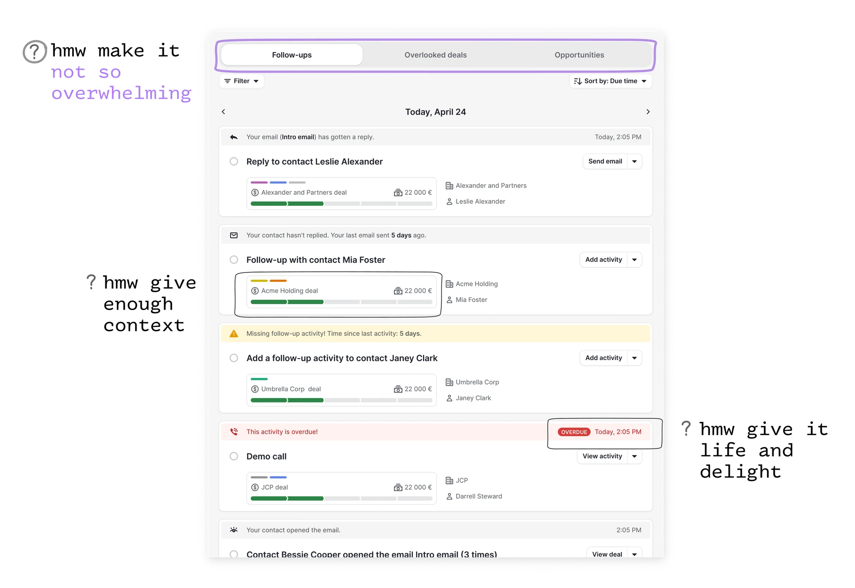
the first version served one action at a time with an ai-drafted reply ready to send. users didn't dislike it. they didn't believe it. we'd asked them to hand over their judgement before showing we understood their job. so every suggestion got grounded in a rule you could check yourself — no reply in five days, no activity scheduled, overdue. then we caught our own feed generating 120+ cards a head, one of them suggesting a follow-up on an email sent 541 days ago. a product promising less noise was manufacturing it. guardrails on stale data took it to 15. the craft was in the card: enough to decide, never enough to bury. context line first, then the action, then who it's about. whitespace turned out to be the biggest lever on “this feels overwhelming” — not fewer features. air.
where it landed
2.15× faster time to action. 21% activation — 3× the users without cards. people started calling the feed their home page. nobody screenshots their pipeline anymore to remember where they left off. that was the whole job. the full story — the org, the other three tools, the directions that didn't work — lives in a deck. happy to walk you through it.